A WordPress responsive website is a digital space intelligently crafted to seamlessly adapt its layout and content across various devices and screen sizes. Whether accessed on a desktop, laptop, tablet, or smartphone, the site dynamically adjusts, ensuring an optimal viewing experience for every visitor. This adaptability is achieved through fluid grid layouts, flexible images, and CSS media queries that tailor the design to match the device’s characteristics. By embracing a mobile-first approach and prioritizing touch-friendly navigation, WordPress responsive websites prioritize accessibility and user engagement. With performance optimization techniques woven into their fabric, these sites not only deliver content effectively but also ensure swift loading times, enhancing user satisfaction. In essence, a WordPress responsive website embodies versatility, accessibility, and user-centric design, seamlessly bridging the gap between digital content and diverse audiences.
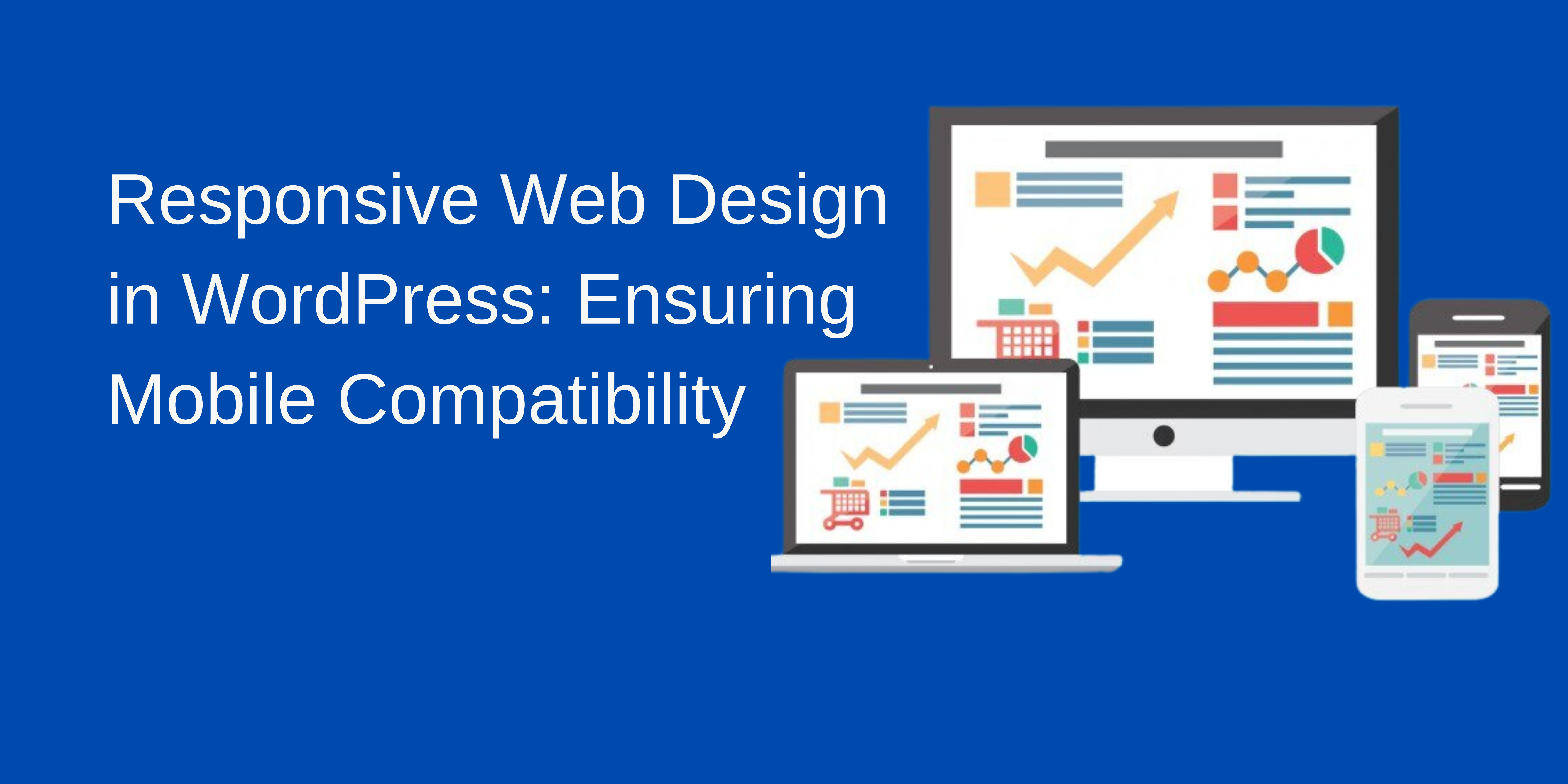
How to make wordpress website mobile friendly
Making a WordPress website mobile-friendly involves several key steps to ensure that your site looks great and functions well on smaller screens. Here’s a guide to help you achieve this:
- Choose a Mobile-Responsive Theme: Select a WordPress theme that is mobile-responsive, meaning it adjusts its layout and design based on the device being used. Many modern WordPress themes are mobile-friendly by default, but you should verify this before making your selection.
- Optimize Images and Media: Compress and resize images to reduce file size without sacrificing quality. Use responsive images that scale based on the device’s screen size. Additionally, consider using HTML5 video and audio players that are mobile-friendly and compatible with various devices.
- Implement Responsive Design: Ensure that your website layout adapts fluidly to different screen sizes using CSS media queries. This includes adjusting font sizes, spacing, and element positioning for optimal readability and usability on mobile devices.
- Simplify Navigation: Streamline your website’s navigation menu for mobile users by using collapsible menus, hamburger icons, or a simplified navigation structure. Make sure menu items are easy to tap and navigate with a finger.
- Optimize Content Layout: Break up large blocks of text into smaller paragraphs and use headings to improve readability. Consider hiding less important content on mobile devices or using collapsible sections to reduce clutter and improve user experience.
- Use Mobile-Friendly Plugins: Choose WordPress plugins that are optimized for mobile devices or offer mobile-responsive features. Avoid plugins that add unnecessary bloat or negatively impact your site’s performance on mobile devices.
- Test Across Multiple Devices: Use tools like Google’s Mobile-Friendly Test or simply access your website on various devices to ensure it looks and functions correctly on smartphones and tablets. Pay attention to factors such as page load times, font sizes, and interactive elements.
- Optimize Page Speed: Improve your website’s loading speed by optimizing images, minifying CSS and JavaScript files, enabling browser caching, and using a content delivery network (CDN). Faster page loading times are crucial for a positive mobile user experience.
- Regularly Update Your Website: Keep your WordPress theme, plugins, and core software up to date to ensure compatibility with the latest mobile devices and browsers. Regular updates also help address security vulnerabilities and performance issues.
By following these steps, you can create a mobile-friendly WordPress website that provides a seamless and enjoyable experience for users on smartphones and tablets.
Types of mobile friendly content

Mobile-friendly content refers to content that is optimized for viewing and interacting with on mobile devices such as smartphones and tablets. There are several types of mobile-friendly content that cater to the unique characteristics and behaviors of mobile users:
- Responsive Web Design: Websites that use responsive design adjust their layout and formatting based on the screen size of the device being used. This ensures that the content remains easily accessible and readable, regardless of whether it’s viewed on a desktop, laptop, tablet, or smartphone.
- Short-form Content: Mobile users typically have shorter attention spans and are often on the go, so short-form content such as concise articles, listicles, and bullet points are well-suited for mobile consumption. Keep paragraphs brief and use headings, subheadings, and bullet points to break up text and make it easier to digest.
- Visual Content: Images, videos, and infographics are highly engaging and can convey information quickly and effectively on mobile devices. Use high-quality visuals that are optimized for mobile viewing, and ensure they load quickly to avoid frustrating users with slow page speeds.
- Scannable Content: Mobile users tend to skim through content rather than reading it word-for-word. Use clear and concise headings, subheadings, and bullet points to make it easy for users to scan and find the information they’re looking for quickly.
- Interactive Content: Mobile-friendly content can include interactive elements such as quizzes, polls, surveys, and interactive infographics. These types of content encourage user engagement and can help keep mobile users entertained and interested in your website.
- Optimized Forms: If your website includes forms for things like contact inquiries, newsletter sign-ups, or checkout processes, ensure they are optimized for mobile users. Use large, touch-friendly form fields and buttons, and minimize the number of required fields to streamline the user experience on smaller screens.
- Mobile Apps: For businesses or organizations with a large mobile user base, developing a mobile app can provide a more immersive and personalized experience for users. Mobile apps can offer features such as push notifications, offline access, and device-specific integrations that enhance the user experience beyond what a mobile website can provide.
By incorporating these types of mobile-friendly content into your website or mobile app, you can better cater to the needs and preferences of mobile users and provide them with a positive and engaging experience.
Benefits of a mobile-friendly WordPress Website built by the experts at Devki Infotech
Choosing Devki Infotech for fixing mobile view issues on your WordPress website ensures expert assistance from professionals well-versed in WordPress customization and optimization. With their deep understanding of WordPress themes, plugins, and responsive design, Devki Infotech offers tailored solutions to ensure your website looks flawless on mobile devices. Their dedicated support, timely resolutions, and comprehensive approach to problem-solving guarantee a seamless user experience across all screen sizes. Trusting Devki Infotech means prioritizing client satisfaction, benefiting from their commitment to delivering high-quality results and ongoing assistance. For a swift and effective resolution to your WordPress mobile view concerns, Devki Infotech stands out as a reliable partner ready to meet your needs.